Why mobile optimisation is a game-changer for your restaurant's online presence.

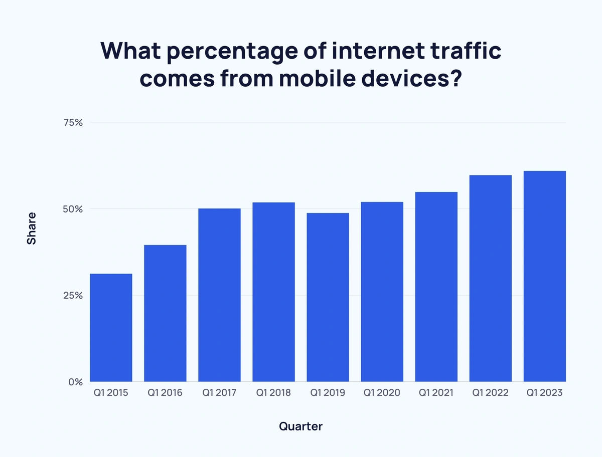
Did you know that more than half of all website traffic comes from mobile devices?
Did you also know that 88% of consumers who search for a type of local business on a mobile device call or go to that business within 24 hours?
What's the takeaway? (I mean the learning point... not the bungkus / tapau food...)
Your potential customers are not browsing on their phones for fun. They’re starving for a food experience and ready to tuck in!
So, as a restaurant owner, this mobile trend is your golden ticket. To benefit, you need to ensure your mobile website is as smooth as your signature dessert.
In this guide, we'll show you how you can make your mobile website as inviting as your eatery. A journey that starts from their search and ends at your doorstep.
- Decoding the responsive mobile website mystery
- Must-dos for your mobile website
- How to build a mobile-responsive website
Decoding the "responsive mobile website" mystery
Have you been hearing terms like "mobile website" and "mobile-responsive website"? Ever wondered what's the difference?
Well, pull up a chair. Don't let predatory web developers fool you.
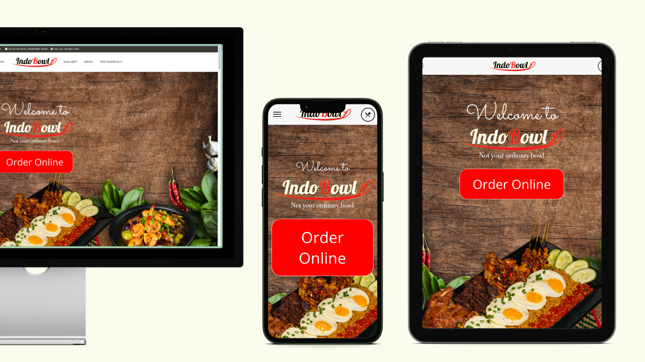
A mobile website is like a twin of your main site, built only for mobile devices.
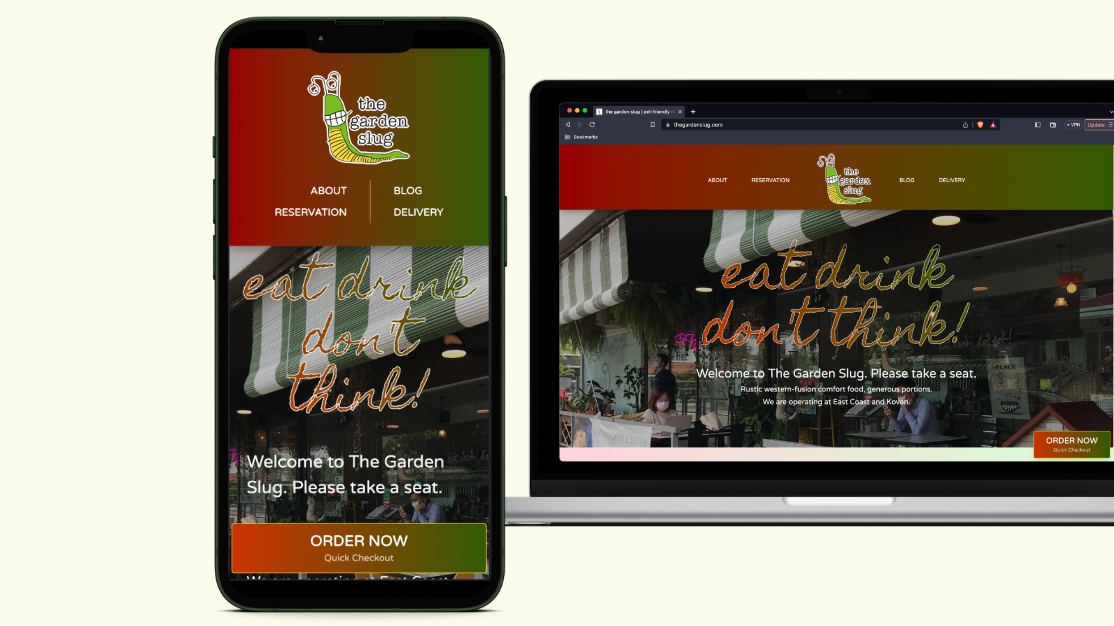
A mobile-responsive website is a shape-shifter. It adapts and adjusts to any device it's viewed on. And guess what? Google ranks mobile-friendly websites higher in search results.
Now, as a restaurant owner, a mobile website (the twin) can be a bit like a troublesome sous-chef. It needs constant attention every time you add or remove something from your site. Because they are in effect separates sites, so you need to update everything twice. Added to that, Google puts it lower down the pecking order in search results. Talk about a recipe for disaster!
A mobile-responsive website design (the shape-shifter), is like a well-oiled kitchen brigade. Mobile-responsive design allows your website to adapt its layout based on the device. You only have to make your updates in one place, not two.
If you're reading this on your phone right now - congrats! You're experiencing a mobile-responsive website! This gives your guests the best experience, regardless of wherever they're browsing from.
Must-dos for your mobile website
So, you're ready to whip up a mobile website for your restaurant? There are a few secret ingredients to keep in the mix.
Remember: Responsiveness Rules
Think about this: your guests will be perusing your website from screens of all shapes and sizes. Most of these screens will be smaller than a desktop screen. It's a bit like trying to fit a 14-inch pizza into a 9-inch box.
Mobile users are 5 times more likely to abandon a task if the site isn't optimized for mobile.
So you'll need to rethink the kind of content you want on your website.
Go take a good, hard look at your website right now. Is there anything on there that is redundant? For example, does your website look like a Picasso painting? Confusing, complex, and unappetising. Too many buttons, too many pages. They're left wondering, "Where on earth do I order the lasagna?"
If that's what your website looks like, out it goes!
Keep it simple and your mobile and tablet users will thank you. Design with the small screen in mind first.
Not sure what to keep and what to throw out? Our quick guide on decluttering your website will help you prioritise.
Got chunky fingers? Upsize everything.
Imagine trying to button up a shirt with oven mitts on. That's how some of your guests might feel navigating a poorly-designed mobile website.
You've gotta make your website as finger-friendly as your restaurant's sticky ribs.
What does that mean? BIG BUTTONS.

And visible text links that even the chubbiest of thumbs can tap without a hitch on a pint-sized screen.
That means saying goodbye to some swanky features like mouseover effects. But hey, it’s a small price to pay for making your mobile site a welcoming place for all your guests, right?
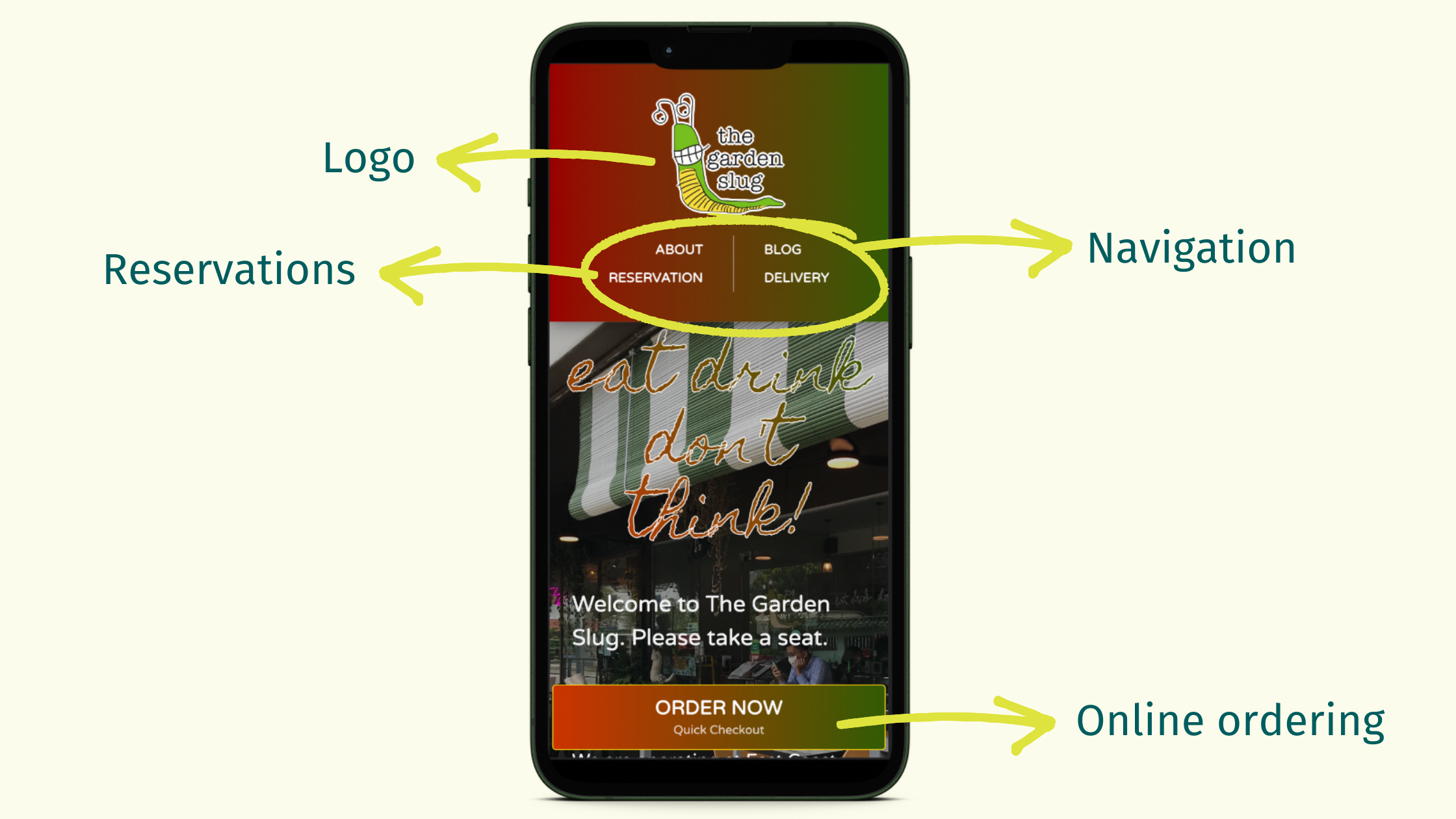
Your guests should be able to access your phone number, or reserve a table with as few finger taps as possible.
Mobile users spend 70% more time on a website if it's mobile-friendly.
Be Fast to prevent the Furious
Ever seen a hungry diner waiting for a table? Not the most patient bunch, ya? And guess what, they're as impatient waiting for your menu to load on their mobiles. So, how can you feed their need for speed? Here are a few tips:
- Trash your Flash Player. It's outdated and doesn't show up on mobile.
- Trim down those image sizes. Keep them under 500kb each.
- Ditch the fancy fonts and animations. Too many can turn your site into a visual buffet, and not in a good way.
- Purge the PDF menus. Your guests want to feast their eyes on your menu. Not struggle with pinch-and-zoom gymnastics!
Mobile users expect pages to load in 2 seconds or less.
We go more in-depth in this post on how to speed up your mobile-responsive website.
Making your website fast and easy to read with HTML menus, befriends you to Google. Your menu is more likely to pop up at the top of search results. Now that's what we call a win-win!
How to build a mobile-responsive website
There are 3 ways: Pay someone, build your own, or use Maynuu.
Pay someone
If you're engaging a web developer, tell them you want a website that is also mobile-responsive. Not a mobile website. You can also show them this guide for a list of things you DO NOT want on your website.
A good website starts at $2,000 for a one-off fee. Or anywhere between $100-$300 a month for subscription-based pricing.
BYO (Build Your Own)
Most modern no-code website builders are already mobile-responsive. So you only have to build it once on a desktop and the platform resizes it to tablet and mobile layouts for you. If you prefer to DIY, we recommend the following tried and tested platforms:
They all come with generous free plans. The paid plans are very reasonable, too.
Maynuu
Surprise! Ya, you can use Maynuu as your main website. Think of it as a 2-in-1 "Linktree + website" combo!
It's got everything a restaurant needs for a high-converting online presence:
- mobile-responsive
- unlimited social links
- unlimited photo uploads
- free space to write anything you want: add your location, phone number, instructions, story...
- digital menu for on-premise (QR code) ordering, reservations, delivery and takeaway
Best of all? It's FREE.
Conclusion
Think about your customers, always on the move, wanting to grab a quick bite or plan a family dinner.
Make it a breeze for them to book a table, locate your eatery, browse your menu, place an order online, or even give you a ring.
All these goodies should be at their fingertips, right on your homepage via speedy links.
What's the result? You'll see more bookings, more happy faces at your tables, more orders, and a nice boost in your revenue.
Mobile ordering and payment options can increase restaurant sales by up to 30%.
Don't let a shabby mobile website send them running to your competitors. Welcome these guests with open arms and ensure they feel your warm hospitality. Not only in your restaurant, but also online. After all, a happy customer is a repeat customer!
If your plans don't include mobile, your plans are not finished.
- Wendy Clark
---
We use the term 'restaurant' throughout the article for consistency. However this guide can be generally applied to any type of food shop, including but not limited to: bakeries, bars, bistrots, boulangeries, butcheries, cafés, caterers, coffeeshops, delis, diners, eateries, food trucks, patisseries, pubs, etc.
Maynuu
❇️ Create your FREE mobile-responsive website today
Maynuu is free for merchants in Malaysia and Singapore.
If you would like to use Maynuu outside of Malaysia and Singapore, please contact Aaron [email protected] and we'll work something out for you.